After years of reviewing manuscripts for high-impact journals in synthetic biology, molecular cell biology, and bioengineering, I’ve noticed a consistent pattern in the figures of standout papers. The strongest manuscripts, those that make me think “I need my papers to look like this” tend to follow a remarkably simple formula. You may have even seen it yourself in papers you admired, but never really noticed the pattern.
What is it? The perfect color scheme? A $10,000 software package? Ten years worth of data? Not quite. The key ingredient is a deliberate strategy that shows your science clearly, convincingly, and completely, starting with how you build your figures. I’ve developed the following framework for building figures that are a feast for the eyes and the minds of reviewers, will ensure that your results are evaluated fairly, and may even earn you some praise (yes, reviewers actually make nice comments):
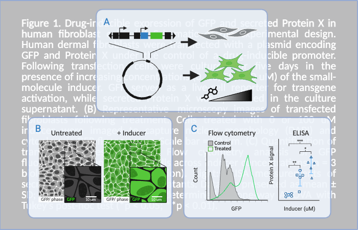
Panel A is for “Action” – A Clear Digital Illustration of the Experiment
Start with a schematic. This is where you show how the experiment was done, not in a cartoonish way, but with functional clarity. This illustration sets up the logic of your experiment, making the rest of the figure easier to interpret. Your diagram should:
- Highlight the key variables and controls
- Include genetic constructs, where critical functional components are labeled
- Show relevant time points, or treatment conditions, especially for step-wise treatments and time-course assays
- Match the experiment described in your results and shown in your data
Panel B is for “Best Example” – A Representative Real Image for Each Condition
Next, give reviewers and readers a visual anchor for each condition. The replicate that you chose should match the mean or median value of the samples within its treatment group, i.e. a “typical” replicate. Examples include:
- High-contrast microscopy images
- Colony growth plates or culture dishes
- Representative tissue samples (e.g., tumors or plant sections)
These visuals add authenticity and context. They help the audience confirm that what they’re seeing in the data matches biological reality. It’s often tricky to find a “photographic” image for biochemical or molecular assays. If you’re stuck, feel free to drop a question in the comments. I’m happy to offer suggestions based on your experiment type.
Panel C is for “Chart” – The Right Quantitative Chart for the Data
Finally, show the numbers clearly and with integrity. Choose data visualizations that suit your measurement type:
- Bar plots or box plots for comparisons
- Scatter plots for single-cell or replicate-level distributions
- Line graphs for time courses
- Pie charts or heatmaps (used sparingly) when appropriate
One of the best ways to get this right? Look at papers in the top journals of your field. These figures often set the standard for what editors and reviewers expect.
Why This Trifecta Works
Together, these three elements allow readers to:
- Understand your experimental logic (A)
- Visualize the result(s) being measured (B)
- Clearly see how (or if) the data support your conclusions (C)
When any one part is missing, reviewers may raise questions about rigor, reproducibility, or clarity. If you’re building figures for a new manuscript or struggling to polish an existing draft, I’d love to help. You can learn more about personalized support through my coaching sessions, or leave a comment below with your question.

Leave a comment